Paddy Power – Chelsea sign
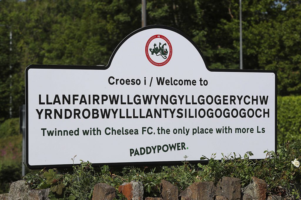
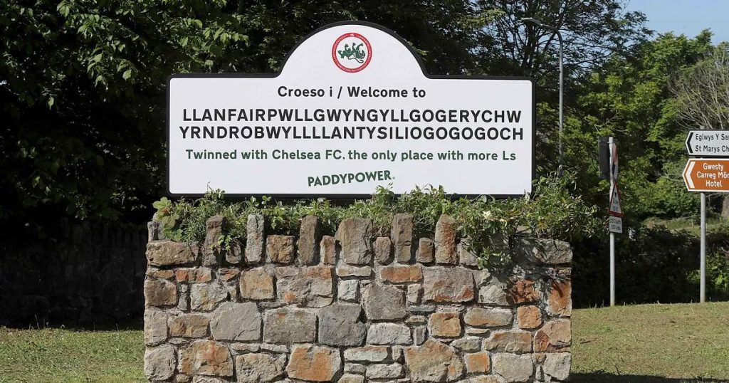
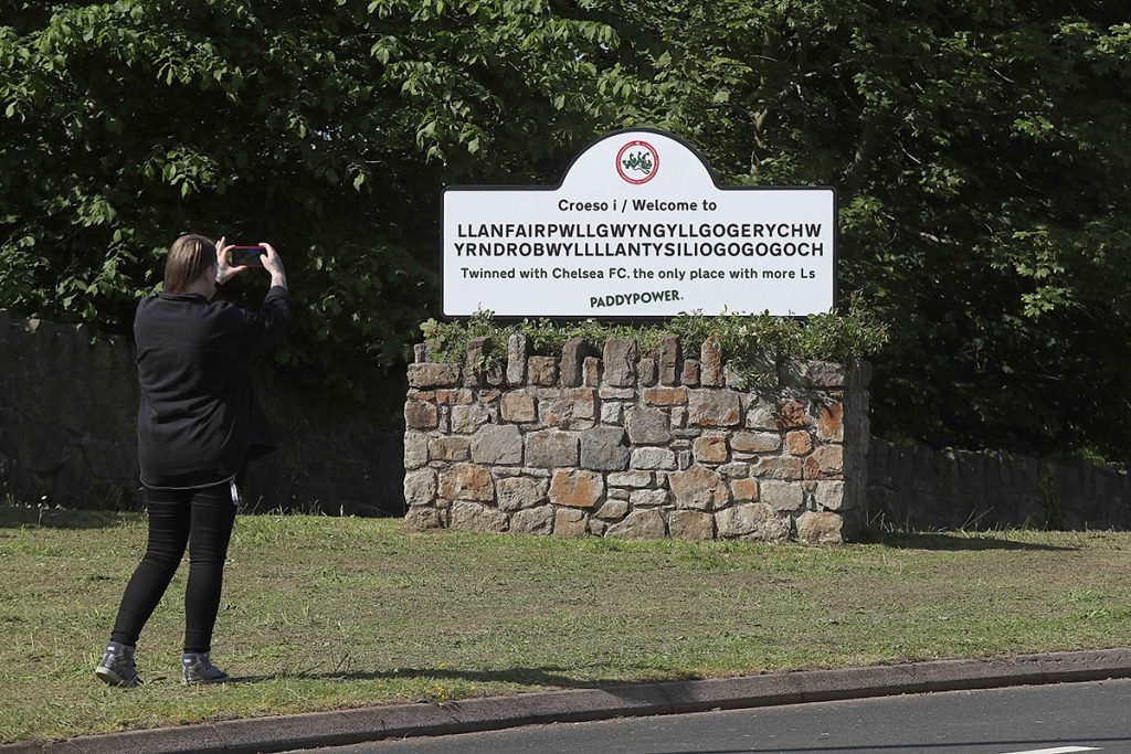
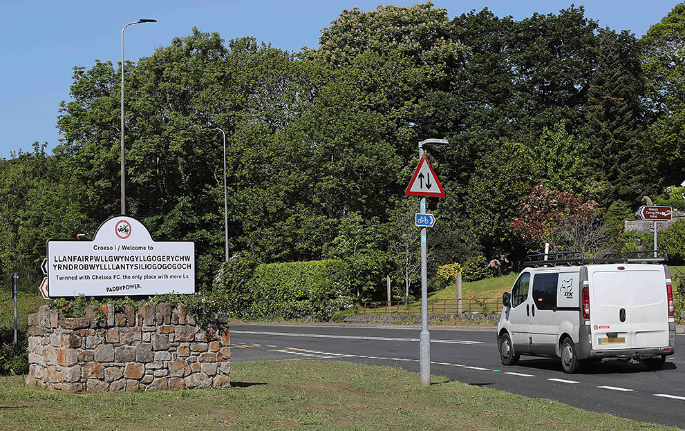
This project was a mischievous creative stunt designed to poke fun at Chelsea FC’s challenging end to the 2022/23 Premier League campaign. The concept centered on a satirical road sign that drew a comparison between the famous Welsh village with the longest name in Great Britain—Llanfair­pwllgwyngyll­gogery­chwyrn­drobwll­llan­tysilio­gogo­goch—and Chelsea’s mounting number of league losses (or “L’s”) that season.

The joke relied on the sheer frequency of the letter “L” in the town’s name, suggesting that even one of the longest words in existence was struggling to keep up with the club’s run of form. To make the stunt feel authentic and high-impact, the visual execution had to be flawless, mimicking the exact look and feel of official British infrastructure.

I was responsible for the graphic design and artwork of the sign. I focused on perfectly replicating the typography, spacing, and color specifications of traditional UK road signage, ensuring that when the sign was installed, it looked like a legitimate, albeit highly sarcastic, piece of highways authority work.

Description

  • Paddy Power

  • May 2023

Artwork for a mischievous sign poking fun at Chelsea's disastrous end to the 2022/23 Premier League campaign.